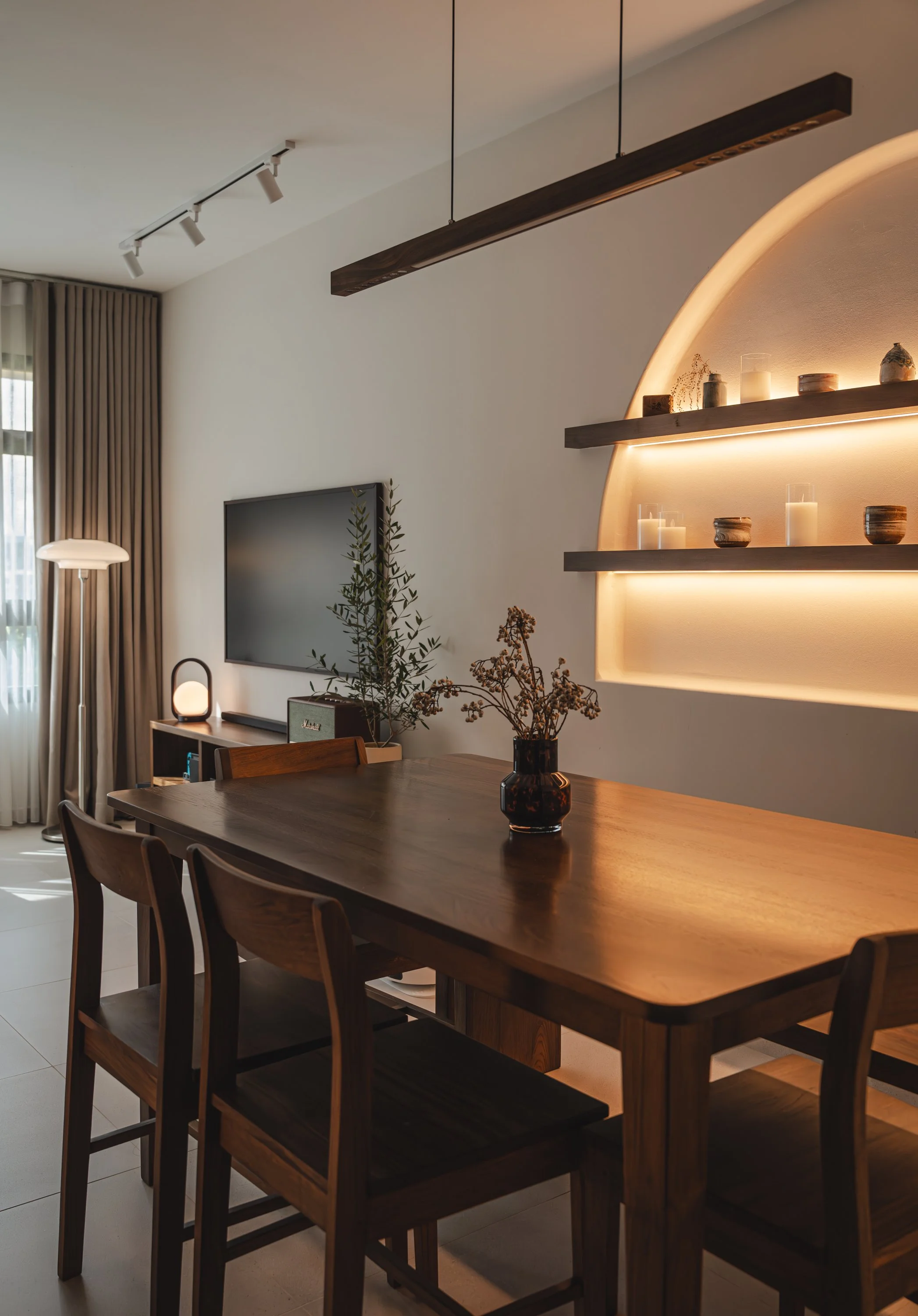
Hire Professional Interior Designer
Achieve your dream home fuss-free with our reliable interior designers.
Personalised Design
Custom solutions tailored to individual tastes and specific space requirements, ensuring that the final outcome is unique and personalized.
Maximising Functionality
Make the most of of space, ensuring it’s not only aesthetically pleasing but also practical
Avoiding Costly Mistakes
With our knowledge & experience, we help prevent costly mistakes & doing the double work. This can help client saving money in the long run
About Our Company
Couple Abode, a boutique interior design firm based in Singapore, is a dedicated team of certified, experienced interior designers committed to standing out from the crowd of generic renovation firms. We transform spaces alongside our clients by combining professional expertise, creativity, and trusted partnerships with vetted contractors and suppliers to ensure top-notch quality. With a focus on seamless communication, detailed drawings, and smooth project execution, we deliver not only aesthetically pleasing designs but also spaces that embody the true essence of interior design—form meeting function, tailored to each user’s needs.
The Process
-

1. Set up a meeting
Schedule a meeting with our designers to discuss your project. This will allow us to gain a clear understanding of your brief and provide you with a proposed design along with an estimated cost.
-

2. Pre- renovation planning
Once the contract is confirmed, we will begin detailed planning for your space. This includes creating professional floor plans, 3D conceptual designs, selecting and purchasing renovation materials, as well as curating furniture, appliances, and lighting plans.
-

3. Renovation Management
After a series of pre-renovation meetings with our designers, we will begin the renovation process once the keys are collected. Our designers will use the confirmed drawings and plans to guide the work, collaborating with our trusted contractors. All communication with the contractors will be handled by our designers, lifting the weight off our clients' shoulders and allowing them to focus on their daily responsibilities.
-

4. Furnishing & Handover
Once the major construction work is completed, we will thoroughly clean the space and assist with the arrangement of furniture for move-in. The handover will be finalized after the interior furnishings are in place, ensuring everything is ready for you to enjoy your new space.
Contact Us
Interested in working together? Fill out some info and we will be in touch shortly. We can’t wait to hear from you!
Location
81 Ubi Ave 4 #01-02 Singapore 408830
Email:
enquiry@coupleabode.com
Contact Number:
Whatapps @ +65 8668 3001


